Master Shape Psychology in Graphic Design: Complete Guide

Well, if I told you that if you could master shape psychology, it would actually change how clients look and respond to your work? By the end of this course, you'll know exactly how to use shapes to influence emotions and perceptions in your graphic designs. But before we move into the advanced sections or look at tips and tricks when it comes to shape psychology, we absolutely have to 100% be clear on what each shape evokes psychologically speaking.
Every Shape Explained
First, we have the geometric shapes, and we're going to start with circles, which are very heavily psychological in graphic design. They have no beginning or no end. They are symmetrical, smooth and enclosed. Circles are often associated with unity, wholeness and harmony. They feel comforting, stable and protective because of their infinite form.
Pepsi's circular logo tries to convey friendliness and community, matching its inclusive, refreshing brand identity. And car brands often use circles in their logos because of the secure and safe factor. And if you're someone who doesn't buy into the whole shape psychology thing, well watch the entire video because we do have some hard evidence for it actually working and being a legitimate thing.
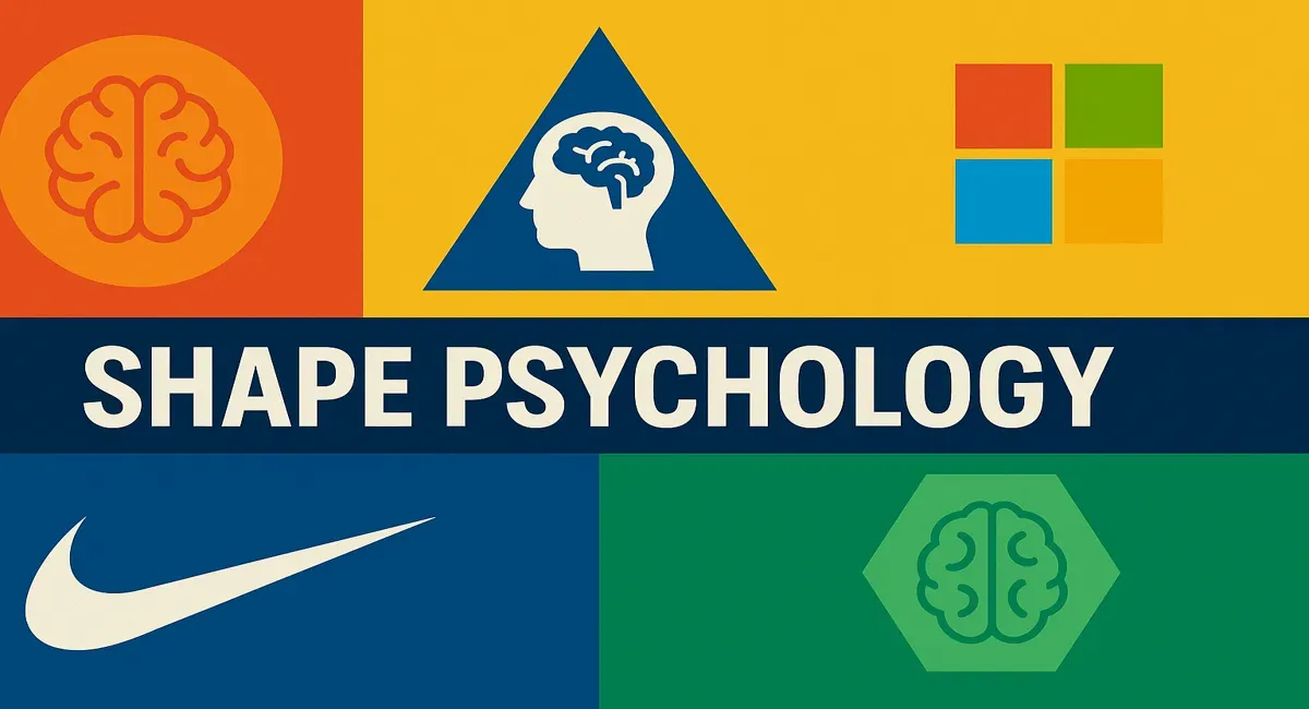
Next we have squares. Now squares represent stability, reliability and professionalism. They often convey a sense of order, structure and trustworthiness. Microsoft's square logo shows the brand's four core products while reinforcing a sense of structure and consistency, and this is ideal for tech giants.
Triangles are quite interesting as they can represent a few different things depending on which way they are pointing. Triangles can signify action, energy or movement depending on their orientation. Upward triangles can suggest stability and progress, while downward triangles can imply instability or focus. The play button icon, typically a triangle pointing right, universally conveys movement and progression, and this enhances its function for media and entertainment purposes.
Like squares, rectangles feel sturdy and dependable but add a kind of directional element that can lead the viewer's eye. They feel secure and organized. National Geographic's yellow rectangular border frames its content with a sense of exploration and focus, encapsulating the brand's emphasis on storytelling.
Now hexagons imply connection and efficiency, often associated with technology or collaboration due to their natural fit in patterns. The logo for Slack uses interconnected hexagons to represent the collaboration that defines the brand, and this hints at teamwork and communication elements.
Ovals feel organic and gentle, often symbolizing motion or the flow of time, and that's with a calming and approachable kind of vibe. The Ford logo uses an oval to give a sense of stability and approachability, softening the brand's powerful automotive image.
And that moves us briskly into the next category of shapes, which is the organic shapes. Organic shapes are simplified or stylized representations, often suggestive rather than literal. They typically have curves and aren't all that geometric. But what about the actual psychology of these shapes?
Well, abstract shapes give a brand or a design a modern, often open-ended feeling, allowing viewers to interpret meaning freely. Organic shapes are often linked to natural products or messages, but of course not always. One example of not always is the Nike Swoosh, as that's an abstract shape that suggests speed and movement, and this enhances the brand's athletic and empowerment identity.
Now one really important part of graphic design is symbolism, and that's where symbolic shapes come into play. Symbolic shapes carry a widely recognized meaning and are often tied to cultural or sociological associations. So things that are literal such as hearts, stars, crosses, arrows, etc. In graphic design, they bring immediate associations and clarity, like hearts for love or stars for excellence. This can be incorporated into concepts for any kind of design.
For example, the heart shape in Airbnb's logo, which symbolizes belonging and feeling at home, and this aligns with their brand mission. Also, on this design here we can see the animated arrow carrying the typography, but the arrow literally suggests movement in the direction of the basketball player. Again, symbolic shapes are very literal and they evoke a message instantly - that's basically their job.
Then we have lines or line-based shapes. These are typically linear shapes or boundaries without fill, and of course can range from straight to wavy lines. Lines can direct focus, suggest movement or create rhythm, adding either calmness or energy. But in general, vertical lines are dominant and energetic, and horizontal lines are more peaceful and more stable. IBM's logo uses horizontal lines within its lettering to create a sense of stability and rhythm while suggesting modernity and connection.
Useful Tips and Uses
So now for the juicy and usable tips that you can use on your designs when using shape psychology. We're talking about the pro tips and the hacks and so forth. And yes, we're also going to look at hard evidence on how this stuff isn't just hocus pocus voodoo BS.
Triangle Movement Hack
So the first hack or pro tip is that triangles are the ultimate tool for creating a sense of movement. You can strategically position triangles to direct the eye and add urgency. Try using upward-pointing triangles to imply growth and ambition, or downward ones for grounding and stability. You can position triangles at image corners to point towards your focal points, and the triangles don't have to be totally obvious.
As you can see in the black space towards the bottom of this design is a right-facing triangle. And also the triangle shape itself doesn't have to be that obvious - it could just be subtle and abstract.
Squares and Rectangles for Organization
Considering that squares or rectangles can create order or stability, it can be a good idea to use these shapes for educational or informative designs. And here's how: try a grid-based layout that uses squares or rectangles for image frames or text boxes. This approach not only organizes content, but it visually conveys dependability and straightforwardness.
When information is laid out in this way, it achieves a more serious and more direct manner. Also, these rigid and balanced shapes help the information to be processed easier by the viewer. And two points to you if you notice the triangle arrows pointing the viewer around this second design.
Rounded Corners for Approachability
If you want a design's message and visual language to be more approachable and more informal, rounded corners on squares and rectangles soften the design and make it feel more approachable. And this is excellent for friendly or casual branding or designs in general. You can see on these examples how more friendly and non-serious the design appears simply because of the rounded corners on the shapes.
Color and Shape Harmony
The next tip is one of my most favorites: try to combine shapes with colors that evoke the same emotion. So if you're using organic circular shapes that are calming, use desaturated calming colors as well. It seems obvious, but many designers don't even consider or think like this.
Movement Through Angles
Slanted or angled shapes add a sense of movement. So for example, maybe for a sporting design you could arrange shapes around the athlete, or simply to imply motion, use triangles in the background to intensify the sense of speed and action. And slanted lines can also evoke a sense of modernity and futurism as they do suggest moving into something new.
Asymmetric Energy
Asymmetric designs create a sense of action and movement, which can energize a layout and draw attention. A dynamic website landing page featuring an asymmetrical grid layout with images and products off-center can create excitement and encourage exploration, making the page feel more lively. This shape psychology refers more to the layout rather than the actual shapes themselves.
Organic Shapes for Wellness
Now if you're working on a design for something like skincare products, wellness or something along those lines, one easy way to make a home-run hitting design is to use organic, free-form shapes to create a sense of comfort. This is instantly often associated with nature and human connection. As an example, a wellness brand could use wavy organic shapes in their package design. This not only creates a calming visual effect, but also communicates a connection to nature and holistic health.
Hard Evidence For Shape Psychology
And now to dispel the myth that shape psychology is a bunch of hype and doesn't have any place or relevance in reality and graphic design, because it does.
Now it's been shown in brain scans that the brain has dedicated areas for processing basic visual elements, including shapes. The primary visual cortex and regions of the occipital and parietal lobes help us interpret shapes and assign meaning based on learned and intuitive associations.
For example, fMRI scans show heightened brain activity in the amygdala - a center for emotions - and that's when viewing angular or sharp shapes. This supports the idea that these shapes evoke stronger, often more intense responses.
But get this: the influence of logo shapes, including those of brands like Pepsi, has been studied to understand consumer perception. Research often cited in this field includes a 2015 study by Dr. Michael Mormann and Dr. Andrew Mitchell. This examined how shape affects brand perception. Their study "Shapes, Colors and Brand Identity: Exploring the Role of Visual Properties in Consumer Response," which was published in Journal of Marketing Research, found that circular logos tend to evoke feelings of warmth, community and harmony, whereas angular logos were associated with durability, strength and professionalism.
But the researchers of a different study in 2013, which was published in the Journal of Experimental Social Psychology, presented participants with images containing basic geometric shapes such as circles, squares and triangles, and this was in neutral colors - as example, black or gray. The simplicity of the shapes helped isolate the emotional impact specifically related to the form rather than other design elements like color or texture.
Participants also viewed a mix of smooth-edged and sharp-edged shapes to analyze the psychological effects of curvature versus angularity in design. The primary tool for measuring emotion was the Positive and Negative Affect Schedule, or PANAS scale, and this allowed participants to rate how each shape made them feel in terms of emotions like calmness, excitement, anxiety or trust.
This approach helped quantify emotional reactions on a standard scale, making the responses comparable across participants and cultures. The results concluded that shapes do evoke specific emotions that can transcend cultural boundaries, though cultural nuances influence how strongly these emotions are felt. They suggest that designers can utilize these findings to create more targeted visuals, choosing shapes that align with the desired emotional impact of a brand or message, such as circles for inclusivity or squares for stability.
Conclusion
So when you're next looking at a graphic design, or better yet looking at your screen while designing your next project, really do consider how shape impacts psychology. Graphic design is visual communication, and shapes are some of the most hard-hitting tools when it comes to evoking messages, emotions and feelings to our audiences. And they won't be able to attract those higher-paying clients.
But if you'd like to learn more crucially important aspects of graphic design, consider checking out my playlist on longer-form videos related to graphic design. And until next time, design your future today. Peace.